The Evolution of the Gibson Logo
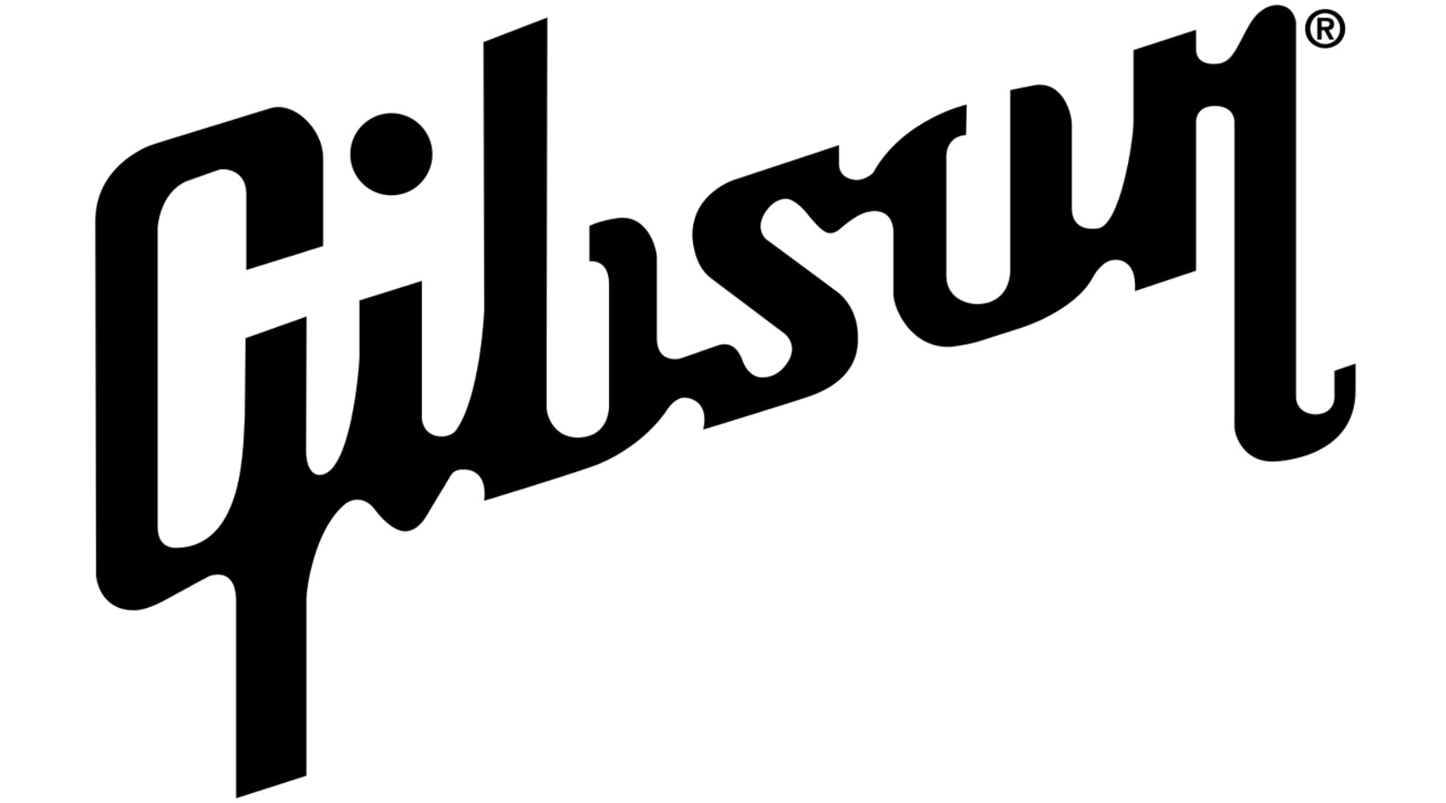
The other day, I was going through a box of old papers when I came across a high-school exercise. Emblazoned across the front cover was a lovingly recreated version of the iconic Gibson logo drawn in biro. Knowing my teenage self, that Gibson logo probably took most of a math lesson to render.
The Gibson logo is iconic. It’s made its way from guitar headstocks to just about everything; t-shirts, coffee mugs, beanie hats and keychains.
But, the Gibson logo didn’t just magically appear. It originally looked very different, evolving over decades into the version we recognize today.
In this article, I’m taking a dive into the history of the Gibson logo and the many revisions it went through.
Part One: 1900s – 1940s
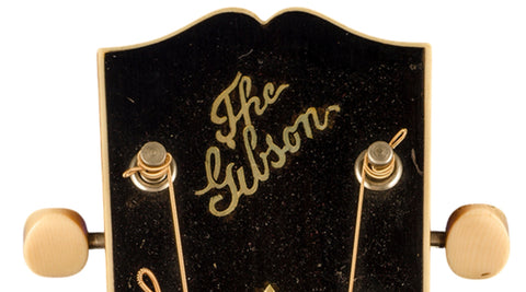
The inaugural version of the Gibson logo can be traced back to 1908, when Gibson first used a seal inside their instruments. This one is executed in a calligraphic type-face, with elegant italicized lettering; setting a trend that would continue until the 1940s.
Notably, those early guitars weren’t just any old Gibson. They were “The” Gibson according to the headstock. While there’s something quite appealing about your instrument being the definitive article, it’s strange to see it presented that way in today’s context.

“The Gibson” logo was originally slanted on the headstock, but by the late 1920s, inlaying it straight became the standard practice.
Then, in the mid-1930s, Gibson dropped the “The”, bringing us one step closer to the iconic logo we know today.

The calligraphic type face remained thin until the late 1930s, when it was beefed up a bit. It was a combination that was bolder and stronger than its elegant predecessor. Then, by the mid-1940s, it was once again slanted, this time at an angle we’d recognize from the modern Gibson logo.

Part Two: 1940s – 1980s
In 1947, the Gibson logo underwent its most radical change. The result was the birth of the classic emblem, which has served as the base for Gibson logo designs ever since.

The old-style calligraphy was gone. In its place was a modern block-style typeface for a brave new post-war world. While recognizably Gibson at this point, there are still some notable differences between this version and the ones that would follow. Notice the curvature on the G and the open “b” and “o.”

By 1951, a couple of significant revisions were made. The lettering became slightly slanted, while the dot of the “i” – which was previously linked to the “G” – became separated. A further revision came in 1967 with the implementation of a squared typeface on the wordmark. At this point, the “b” and the “o” were once again closed off, while the dot above the “i” disappeared.

Five years later, in 1972, the dot was reinstated. Then, finally, in 1981, the Gibson logo that we know today was introduced. The “b” and “o” were opened up again, and the letter “n” was now connected to the top of the “o.”
It took seventy-three years for the Gibson logo as we know it to materialise… I suspect that high school students will be emblazoning it across their exercise books for decades to come.
Are you a Gibson player? Do you remember getting your first Gibson instrument? And what’s your favourite iteration of the logo? Share your stories in the comments.


